Web Safe Colors
Color is an amazing thing. It can affect our emotions, making us excited or calmed, happy or sad. Color can be interpreted in different ways, not just depending on the science of how light and color are absorbed and reflected in the eye but also depending on age, sex, culture and class. Selecting your target audience will have some impact on the color scheme you choose. The basics of color theory can be explored at this page at About.com. We can help you to select appropriate colors for your website according to your expected audience.
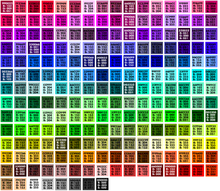
Wondering what this "web safe color" thing is all about? Well computers vary drastically, from types of computers, operating systems, web browsers, Internet connections and so on. This group of "web safe" colors are, well exactly that....they are the colors that are the most dependable to show up as desired on the most people's computer monitors.
Web Safe Fonts
Selecting the appropriate font type and style for your website copy is important, much more important than the average website owner realizes. The font you choose to use will affect the emotion your site evokes (sophisticated, fun, casual, etc) and its usability. Some fonts are more legible in a digital format and only a few are most readily available across the many computer configurations.
You want to choose font types that are:
- Appropriate for your target audience and fits the feel of your site
- Kind to the human eye in a digital format
- Widely available across different computers
There are two general types of fonts "serif" and "sans serif".
- Serif Fonts have fine cross-lines at the ends of the letter.
- Sans Serif Fonts (sans means "without") are fonts that don't have serifs. Verdana is an example of a common sans serif font while Times New Roman is probably the most common serif font.
Each font type is known for different qualities in character, availability and readability. Below is a general overview of each of the most commonly used "web safe fonts". From a usability standpoint, you will find that Verdana is the best font for the web. If you are looking for a good serif font, Georgia is the best option. Arial remains a good option for particular pieces of text, like headlines and titles, where a different font is desired and typically you use larger sized fonts. While this may seem a little confining, making your site text easy to read for the largest number of people will undoubtedly increase your odds of success using the Internet as a vehicle to deliver information to your customers and site visitors.
Arial (Helvetica is the Mac equivalent to Arial)
- Character: Has a clean, modern look but can come off as plain.
- Availability: High availability. It is probably the most common sans serif font. It is the default font for Windows, and has been shipped as a standard font since Windows version 3.1.
- Readability: Average readability. The spacing between letters is often too small and at smaller sizes can cause eye strain. Letter spacing can be compensated for in a letter spacing property in your style sheet, increasing white space and readability.
Times New Roman (Times is the Mac equivalent to Times New Roman)
- Character: Serious, formal and old fashioned.
- Availability: High availability. Probably the most common serif font and is the default font for web browsers and has been shipped as a standard font since Windows version 3.1
- Readability: Average readability for font sizes of 12pt. or larger but poor for smaller sizes. More readable in print so this font can be used on printable pages.
Verdana
- Character: Modern, friendly and professional.
- Availability: High availability. Verdana has been shipped with Internet Explorer since version 3. It was created to meet growth of the Internet and a high demand for a new font that was easy to read in a digital format.
- Readability: Exceptional. The wide body and spacing of letters makes it the most readable font for o¬n-screen reading.
Georgia
- Character: Modern, friendly and professional.
- Availability: Good. It was introduced by Microsoft with Internet Explorer version 4, when the growth of the Internet displayed the need for a serif font that was more readable than Times New Roman.
- Readability: Very good. It is the best serif font for online reading.
Comic Sans Serif
- Character: Informal and friendly. Can appear childish.
- Availability: Good. It was introduced by Microsoft as an alternate sans serif font.
- Readability: Good. Mimics the writing in comic books (hence the name).
Trebuchet
- Character: Clean and Modern.
- Availability: Good. It was introduced by Microsoft as an alternate sans serif font.
- Readability: Good. Can be difficult to read at smaller sizes.
Courier New
- Character: Old Fashioned, Simulates an old Typewriter.
- Availability: Good.
- Readability: Good. Can be difficult to read at smaller sizes.